This page showcases the coding challenges I completed as a part of the Portfolio Tasks for the course "PP434: Automated Data Visualization for Policymaking" as part of my Master of Public Policy programme (2025–26) at LSE.
CC1: Child Poverty in the Developing Countries vis-a-vis the UK
Figure 1: Child Poverty in Developing Countries
Figure 1 highlights that in most of the sub-Saharan Africa countries over 50 percent children lives in households with income below the national poverty line. In countries like South Sudan and Zimbabwe, over 70% of the child population is classified as poor.
Figure 2: Child Poverty Rates by Ethnic Groups in the UK
Figure 2 shows how poverty across different ethnic groups in the UK evolved between 2002/03 and the outbreak of the Covid-19 pandemic. While rates for Bangladeshi, black African and Pakistani children remained high, there were dramatic reductions during the decade from 2002/03, when there was substantial investment in financial support for families with children.
CC2: Labour Market Indicators of India
Figure 1: Unemployment Rate in India (15-64 years)
Figure 1 highlights that the unemployment rate in India rose to an all time high in 2020 in the last 45 years-crossing the 10% mark.
Figure 2: Employment to Population Ratio (15-64 years)
Figure 2 highlights that the Employment to Population Ratio also known as Workers Population Ratio in India dipped during 2020 likely due to Covid-19. The WPR of around 47 percent means that less than half of India’s working-age population is employed, indicating low utilisation of the country’s labour potential.
CC3: The Poverty Debate in India
The Indian government’s claim that poverty fell to 5.3% relies on a $3/day line unsuitable for an LMIC and survey methodology changes; the LMIC cut-off shows nearly one-quarter remain poor.
Figure 1: Extreme Poverty Cut-Off
While the reduction in extreme poverty level is an achievement worth acknowledging, experts have argued that 5.3% figure rests on methodological changes, including the adoption of Modified Mixed Reference Period, which tend to lower poverty estimates. And the $3/day line itself reflects little more than bare survival.
Figure 2: LMIC Cut-Off
India is a lower-middle-income country, and at the world bank $4.20/day LMIC threshold its poverty rate remains 23.9%.
CC4: Busting the Politics around Petrol Price Hike
I replaced the political infographic (Figure 1) with a neutral bar chart (Figure 2), added clear labels and percentage changes, corrected misleading framing, and used proper scales and dates.
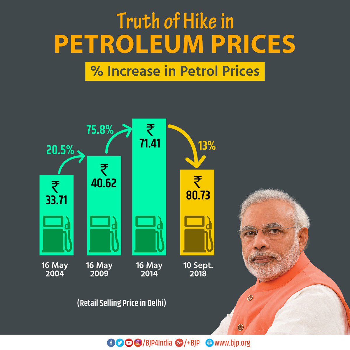
Figure 1: BJP's Social Media Post on Petrol Price Hike in India
Found this chart on BJP X handle which misrepresents prices with distorted bar heights, inconsistent arrows, and distracting political imagery.
Figure 2: Corrected Representation of Change in Petrol Prices
The above bar chart shows petrol price changes over time using proper scaling, readable labels, and neutral design choices.
CC5: API & Data Scrapping
In this section I use a live link to an API from our World in Data Portal (Figure 1) and have used a Google Colab python notebook to scrape wikipedia HDI table (Figure 2)
Figure 1: (API Chart) Life Expectancy in India
This chart uses a live API from Our World in Data.
API endpoint used:
https://ourworldindata.org/grapher/life-expectancy.csv
Figure 2 (Scraper Task): HDI of Indian States
I scraped a Wikipedia HDI table into pandas, cleaned and reshaped into tidy long form, then visualised state-level HDI values in Vega-Lite.
Data scraped and tidied in this Google Colab notebook:
My Notebook
CC6: India's Labour Market Dashboard (World Bank API)
Six mini time-series charts built from World Bank World Development Indicators for India,
batch downloaded via a Python loop and embedded using a Javascript loop.
I looped over World Bank APIs in Python to batch-download six labour series for India,
saved them as JSON, and embedded all charts using a Javascript loop.
CC7: Multidimensional Poverty in India at State and District Level
In this coding challenge I produced two maps to showcase the MPI HCR state wise (Figure 1) and location of top 50 multidimensionally poorest districts of India (Figure 2).
Note: With permission from the grading team, I mapped India for this coding challenge.
Figure 1: Incidence of Multidimensional Poverty in India, HCR (%), 2023
This choropleth map shows the Multidimensional Poverty Index (MPI) headcount ratio
by state/UT in India, using state-level MPI estimates from NITI Aayog and a
state boundary map of India. I manually compiled state-wise MPI headcount ratios from the NITI Aayog national MPI report into a CSV file, and used an India state boundary JSON. The matching of state names was handled directly in the Vega-Lite spec so that each polygon is shaded by its MPI value.
Figure 2: Location of Top 50 Multidimensionally Poorest Districts of India
This coordinate map displays India’s 50 poorest districts (Red Dots). District-level MPI data were compiled from the NITI Aayog report and geocoded in Google Colab to obtain latitude–longitude coordinates.
My Notebook.
The coordinate map reveals strong spatial clustering of multidimensional poverty. 41 out of the 50 districts with the highest MPI headcount ratios are concentrated in just four states i.e., Bihar, Jharkhand, Uttar Pradesh, and Madhya Pradesh which shows that the regional concentration of multidimensional poverty in eastern and central India.
CC8: Trends in Breakfast Cereal Prices in the UK, 2023 - 2025
In this coding challenge, I produced two visualisations: the first presents a time-series of weekly average breakfast cereal prices to illustrate price dynamics over time (Figure 1), while the second compares price volatility across retailers to highlight differences in pricing strategies over the full sample period (Figure 2).
Figure 1: Average Weekly Prices of Breakfast Cereals in the UK (£), 2023–25
Figure 2: Price Volatility in Breakfast Cereal Prices by Retailer, 2023-25
Using Google Colab, I cleaned and merged AutoCPI price and item datasets, filtered observations to breakfast cereals, and reduced millions of daily prices through aggregation. Weekly average prices and store-level price volatility were computed, saved as CSV files, and subsequently visualised using Vega-Lite to illustrate temporal dynamics and retailer pricing behaviour.
CC9: Interactive Human Development Index Trends for India
Figure 1: HDI and Constituent Indicators Over Time
This interactive chart allows users to explore trends in India's HDI score and its constituent indicators value over time using a dropdown selector.
Figure 2: Trends in Statewise HDI Score and GNI per Capita (1990–2022)
This bubble chart uses a year slider to show how Indian states move jointly on two dimensions: HDI (x-axis) and log GNI per capita (y-axis).
Bubble colour reflects HDI category (Very High, High, Medium, Low), highlighting how income growth and human development have evolved and diverged across states over time.
CC10: De-trended Regression — HDI vs Income (Indian States, 2022)
Hypothesis:
After controlling for income, Indian states differ systematically in HDI outcomes, reflecting variation in social investment and policy effectiveness.
Figure 1: HDI vs log GNI per capita (with fitted line)
Scatter plot of observed HDI against log GNI per capita, with the fitted regression line (predicted HDI).
Figure 2: HDI residuals after accounting for income
Data Cleaning & Analysis:
I estimated an OLS regression of HDI on log GNI per capita in Python using sklearn.
Predicted HDI values and residuals were computed and exported for Vega-Lite visualisation.
View Google Colab Notebook
Finding:
While income explains a significant share of HDI variation (Figure 1), the residual distribution (Figure 2) highlights persistent state-level differences, pointing to the role of non-income policy driver.
Method:
Supervised machine learning (linear regression). Input matrix X = log GNI per capita; target vector Y = HDI.